
Zephyr – Material Design Theme
Material Design Theme
Zephyr – Material Design Theme is a design framework that uses Google Material Design concepts to produce visually beautiful and functional user experiences. It emphasizes on providing a uniform and responsive experience across multiple devices and platforms. A carefully chosen color palette, modern typography, user-friendly iconography, and a grid-based layout system are all essential features. Components like buttons, cards, and dialogs are built with simplicity and usefulness in mind, resulting in a consistent look and feel.
This theme highlights the utilization of motion and interaction to improve the user experience. Smooth animations and transitions give feedback and direct users’ attention while avoiding distraction. By following to Material Design’s key concepts of bold graphics, meaningful motion, and material as a metaphor, Zephyr builds interfaces that are not only aesthetically beautiful but also intuitive and user-friendly.
Key Features
- Color Palette:
- Primary and accent colors for visual appeal and brand identity.
- Neutral colors like gray and white to balance the design.
- Typography:
- Use of modern sans-serif fonts like Roboto.
- Clear hierarchy with varied font sizes, weights, and line heights.
- Iconography:
- Simple, intuitive icons for enhanced user comprehension.
- Consistent style and size across all applications.
- Layout:
- Grid-based layouts for consistency and alignment.
- Responsive design for compatibility across devices.
- Adequate spacing between elements to avoid clutter.
- Components:
- Raised, flat, and floating action buttons with clear call-to-actions.
- Modular and reusable cards for content display.
- Modal dialogs for focused user interactions.
- Interaction and Motion:
- Smooth transitions and animations for feedback and guidance.
- Visual feedback mechanisms like ripples and color changes.
- Consistency and Usability:
- Unified look and feel for a cohesive design language.
- Intuitive interfaces prioritizing ease of use.
- Implementation Tools:
- Material-UI for React applications.
- Vuetify for Vue.js applications.
- Angular Material for Angular applications.
- Flutter for natively compiled applications with Material Design support.
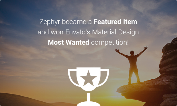
Theme Features
- Awesome Design with Great Attention to Details
- Based on the latest design trend (Material Design)
- Authentic motions, responsive interaction, hierarchical timings
- Retina Ready, Ultra-High Resolution Graphics
- Fully Responsive, and this can be turned off
- Focus on typography, usability & user-experience
- Parallax Effect Backgrounds
- 8 appearance animations for columns and images at any pages
- Test-drive before purchase
- Easliy test-drive the theme with your favourite plugins and your content (via themetest)
- Easy to install and use
- Quick Install & Demo Content Import
- Built-in drag’n’drop Visual Composer ($34 value)
- Automatic Theme Updater
- Excellent Customer Support
- Free Updates
- Brief documentation, that covers all the frequently asked questions
- Special Support Forum for custom requests
- Awesome Sliders Inside
- Slider Revolution Included ($19 value)
- 2 pre-built Slider Revolution import files
- Bundled Fotorama for image sliders
- Bundled Slick Slider for client logos carousel
- Unlimited Color Options
- 6 predefined color styles
- 40 theme color groups customized in theme options (even more with CSS)
- Advanced Portfolio Options
- Custom URL slug for your portfolio items
- 5 awesome hover effects
- 2-5 columns
- 3 title alignments
- 5 tiles proportions
- Pagination / ajax load
- Category filters
- Advanced Blog Options
- 3 layout types (Small Image, Large Image, Masonry Grid)
- Show/hide any post meta element (date, author, comments, categories, tags and “Read More” button)
- Pagination / ajax load
- 3 excerpt types
- Advanced Typography Options
- Use Google Font or web-safe font combination
- Set different font sizes for 9 element groups on desktop and mobile
- Translation Ready
- WPML Optimized
- Custom language switcher links can be set up from theme options
- Advanced Customizations Are Possible
- Separate theme options field for Quick CSS
- Separate theme options field for Custom HTML
- Child Theme Compatible — includes basic child theme
- Easy-to-use Elements: Accordion & Toggles, ActionBox, Button, Contact Form, Counter, IconBox, Image Gallery, Image Slider, Google Map, Message Box, Portfolio Grid, Responsive Columns, Separator, Social Links, Tabs & Timeline, Team Member, Testimonial, Video Player.
- Other Cool Features
- Full compatibility with Contact Form 7 plugin
- 1273 icons integrated (519 FontAwesome icons + 754 Material Design icons)
- Code built with SEO (Search Engine Optimization) best practices in mind
Conclusion
In summary, Zephyr – Material Design Theme provides a comprehensive framework for developing visually beautiful and user-friendly interfaces. Zephyr maintains a unified and consistent design across several platforms by employing essential characteristics such as a well-defined color palette, modern typography, intuitive iconography, and grid-based layouts.
Additionally, there are tons of incredible pre-made sites that you may use to expedite the building of your crowdfunding website. Many excellent WordPress plugins that improve your website and work with Zephyr – Material Design Theme. View the Zephyr – Material Design Theme. LIVE DEMO.


Reviews
There are no reviews yet.